Blog Page Design for B2B Content Programs
Restructure your blog feed around buyer stages, not publish dates.

Most B2B blog pages fail because of architecture, not aesthetics. The standard format, a reverse-chronological feed of articles stacked newest to oldest, has almost nothing to do with how B2B buyers actually research, compare, and decide in 2026.
Buyers today do their homework alone. They compare vendors on their own terms, dig through content at their own pace, and often arrive at a decision before a salesperson ever says hello. The blog feed was built for a different era, one where "newest post first" was a reasonable way to organize a page. That era is over, and the feed never got the memo. A visitor lands looking for an answer to a specific problem and instead finds a pile of articles sorted by publish date, like a filing cabinet organized by the day each folder was tossed in. Nothing about that layout helps a buyer figure out whether this vendor understands their problem. It just shows what the marketing team got around to writing last Tuesday.
A blog page's role in a B2B buyer's journey
A blog page functions as a wayfinding system. Its job is to route each visitor toward content that matches where they stand in the decision process, not to flash the newest post like a diner special.
Three distinct buyer stages call for three distinct content types. Early-stage visitors need educational material and thought leadership that helps them understand the problem they are even trying to solve. Mid-stage visitors need validation: case studies, proof points, whitepapers, anything that builds enough confidence to keep reading instead of closing the tab. Late-stage visitors need clarity: pricing, process, next steps, the practical details that remove the last bit of friction before they pick up the phone.
Pushing every visitor toward the same sales CTA ignores all of that. Asking an early-stage reader to "book a demo" is like proposing marriage on a first date. It asks for a commitment before any trust has been built, and it tends to scare people off rather than move them forward. Every important page on a B2B site should answer one question clearly: what should this visitor do next? The honest answer changes depending on the stage that visitor is in, and the page has to reflect that. Blogs and guides serve early-stage learning. Solution pages serve evaluation. Comparison pages serve decision-stage shortlisting. A blog page has to know which of these jobs it is doing at any given moment, because it cannot do all three at once and do any of them well.
Messaging architecture must be locked before any layout decision
A blog page that fails to guide buyers almost always has a messaging problem wearing a design costume. No amount of clever layout fixes unclear positioning, the same way no amount of furniture arranging fixes a house with no foundation.
A strong B2B site answers three questions within the first few seconds a visitor spends on it: does this company understand the visitor's problem, can they solve it, and can they be trusted? Those questions apply to a homepage, and they apply just as much to the entry point of a blog or resource section. If a visitor cannot quickly figure out what the content program is about, who it is for, and why this particular vendor has any authority to be writing about it, they leave. They leave before the navigation gets a chance to help them and before any CTA gets a chance to convert them.
Strong B2B sites state their value proposition early and in plain language, skip the buzzwords, and make it obvious who the solution is actually for. A blog section header and category structure need to clear that same bar. A category labeled "Insights" tells a visitor nothing. A hero section that spends three paragraphs describing the company's "innovative approach to synergistic solutions" describes the company instead of the reader's problem, which tells a visitor even less. Before any team decides on filters, grid layouts, or where a CTA button should sit, someone needs to be able to say, in one sentence, what each content category is for and who it serves. Skipping that step is common among lean teams racing to publish, and the result is a content library that nobody can navigate, including the people who built it.
Moving from a blog feed to a structured resource center
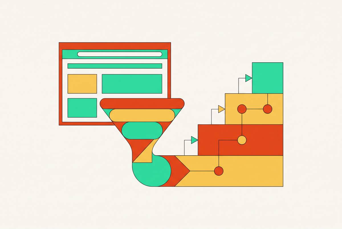
The fix for the reverse-chronological feed is a structured resource center. Content gets organized by topic, buyer stage, and industry or use case, with filters, categories, varied formats, and CTAs working together to help a visitor find what they need without digging.
The organizing principle changes. The structure moves away from "what did we publish lately?" and asks the structure asks "what problem does this solve, and for whom?" That single shift makes the page useful to a first-time visitor and to a returning buyer who is three weeks into evaluating five vendors and just needs the pricing page this time, not the beginner's guide again.
Picture what a visitor actually sees landing on a resource center built this way. Instead of a wall of thumbnails sorted by date, there are clear topic clusters: a section for people just learning about the problem space, a section of case studies and proof points for people comparing options, a section with implementation details and pricing structure for people ready to move. Varied formats live inside each cluster, long-form guides next to short explainers next to comparison pages, so the same topic can serve a reader who wants five minutes and a reader who wants forty-five without forcing either of them into a separate navigation path.
Rigid, one-size-fits-all blog templates give way to layouts built around what each page is actually trying to do. A case study page blends data visuals with narrative text. A comparison page uses a table because a table is the honest way to show a comparison. Internal linking becomes contextual. An early-stage explainer links to a related case study. A comparison page links to the relevant solution page. None of this depends on a "related posts" widget quietly guessing what else might interest someone based on category tags.
The page-level design decisions that move readers forward rather than stopping them
Once the architecture is right, individual page design either reinforces that journey or quietly sabotages it. Most of the damage done at this level comes from friction, not from ugly design.
CRO-focused design with clear messaging and one goal per page consistently outperforms flashy visuals. That discipline, one goal per page, applies to a blog or resource page exactly as much as it applies to a landing page built for a paid campaign. A page trying to educate, convert, and upsell all at once usually accomplishes none of the three.
Progressive disclosure helps here: a page opens with a clear positioning statement and a high-level overview, then lets the visitor scroll or click deeper into features, use cases, or technical detail as their interest demands. This mirrors how buyers actually read. Nobody wants the technical appendix shoved in their face in paragraph one, and nobody wants to hunt for it later once they're ready for it either.
Large headlines paired with short top-line messaging work the scanning visitor hard in the first few seconds, while supporting smaller-type content underneath rewards the reader who sticks around and gives search engines more to work with. Sticky menus matter on long-form pages too. A visitor fifteen paragraphs into a procurement guide should not have to scroll back to the top just to find the next section. That's a small thing with an outsized effect on whether someone finishes a long piece or gives up halfway through.
CTAs need to match the buyer's actual position, not the seller's wish list. A specific, value-driven CTA aligned with the content around it performs better than a generic one. "Download the procurement guide" belongs on a mid-stage piece. "Book a demo" belongs nowhere near an awareness-stage blog post, the same way a wedding ring doesn't belong on a first date.
Where trust signals belong on a content page
Trust signals do not work as a single logo graveyard parked at the bottom of a page. They work when they are placed exactly where a visitor's doubt is about to peak.
B2B buyers evaluate risk constantly as they read, not just value. The real design question is where in the reading experience skepticism is most likely to spike, and what resolves it right there. Near a CTA, trust signals reduce hesitation at the exact moment someone is deciding whether to click. Trust signals on a service or solution page reinforce that the company can actually do what it claims. Trust signals embedded directly inside long-form content add weight to specific claims the moment those claims get made, rather than asking the reader to take it on faith until the footer.
Case studies with measurable outcomes, testimonials with real names and titles, and client logos all serve as proof, not decoration. The best B2B pages prove the claim in their headline within the first scroll, using real client results instead of vague promises, and that discipline applies to a content page as directly as it applies to a landing page built to sell.
For lean B2B teams and the creative partners supporting them, brand consistency across every content page is itself a trust signal. A blog that looks and reads like three different companies stitched together tells an enterprise buyer exactly the kind of internal disorganization they are trying to screen out before signing a contract.
How AI-mediated discovery changes content page structure
AI systems now summarize and surface B2B content directly, and page structure has become a prerequisite for getting found this way, not just a nicety for human readers. Content that is vague, scattered, or poorly organized risks getting misread or skipped entirely by these systems. A B2B site now needs to communicate clearly to people and to machines reading on their behalf.
The resource center architecture described earlier happens to fit this requirement well. Clear topic clusters with logical internal linking give an AI system an accurate map of what a content program covers and how the pieces connect to one another. A scattered blog feed gives that same system nothing but a pile of dated articles with no clear relationship to each other, a tough thing to summarize accurately.
This is not a technical SEO checkbox tacked on after the real design work is finished. It belongs in the same information architecture conversation as buyer-stage mapping and CTA logic, because the structure doing the work for a human visitor is the same structure doing the work for a machine trying to represent that content accurately elsewhere.
How a lean marketing team builds and maintains these pages
A resource center only compounds authority over time if someone keeps tending it. The best-performing B2B sites are treated as living systems, monitored and refined based on actual data and behavior. The design work is never really finished. Ongoing creative judgment has to replace the assumption that a launch is a finish line.
The most common failure for lean teams appears months after launch, not on day one. The architecture gets built correctly at first. Then, without senior creative ownership keeping watch, category labels start to drift. New posts get filed wherever is convenient. CTAs stop matching the buyer stage of the page they sit on. Bit by bit, the carefully structured resource center reverts to the very feed it was built to replace, like a clean desk that quietly turns into a pile again without anyone deciding to let it happen.
Keeping that from happening is not a one-time design project. It is an ongoing discipline: someone has to own the category structure, audit where new content actually belongs, and check that every CTA still matches the page it is attached to. For a founder or a small marketing team without the bandwidth to do that daily, the architecture described throughout this piece only holds if someone, somewhere, is responsible for defending it.