SaaS Website Design Principles That Support Pipeline Growth
Faster sites with product demos convert better and fill pipeline.
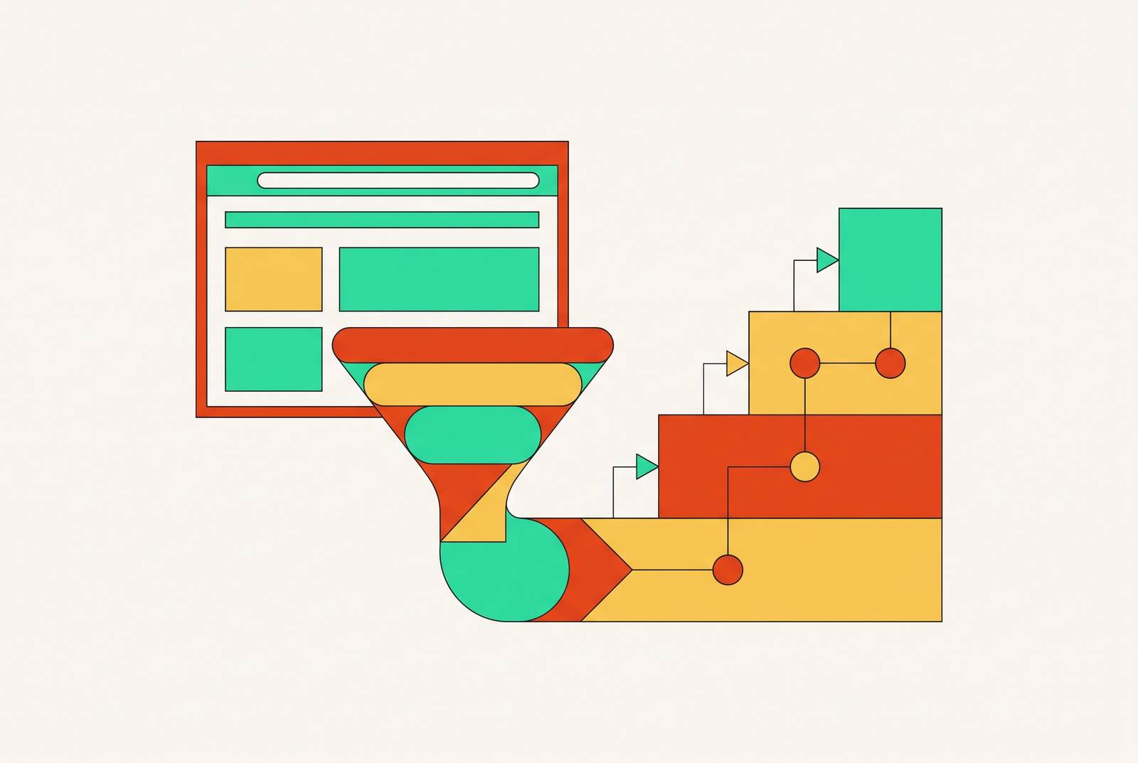
Run the math first, because the math is the whole argument. A site converting at one percent needs triple the traffic of a site converting at three percent to land the same number of deals in the pipeline, and no amount of paid media fixes a site that leaks that badly. That's the core function of a SaaS website: moving a buying committee from "never heard of you" to "let's sign," with every button, headline, and layout choice either pushing that movement forward or getting in its way.
The committee's presence means every page has to answer several people's different questions at once, without confusing any of them. A B2B SaaS deal rarely involves one visitor making one decision in one sitting. It involves several people, from several departments, hitting the same pages on different days with different questions in mind, and the site has to answer all of them without confusing any of them. A champion might show up looking for product fit, while the economic buyer might land separately looking for cost and risk. Same site, same pages, completely different jobs to do depending on who's reading.
Speed is part of that job, and it's a bigger part than most teams budget for. Brain Buzz Marketing's 2026 analysis found that a one-second load delay measurably drops conversions, and with more than half of all traffic now arriving on mobile, page speed stopped being a developer's problem and became a pipeline problem. Current practice sets the bar at a Largest Contentful Paint under 2.5 seconds, judged against the Core Web Vitals trio of LCP, INP, and CLS. That benchmark will come up again, because it underwrites almost everything described later in this piece.
Sales teams sometimes push back here: "our conversion problem is a sales problem, not a design problem." Fair question, wrong villain. Most members of a buying committee form their first impression of the product on the website, often well before a salesperson ever gets a name and a phone number. By the time sales picks up the phone, the website has already done (or failed to do) most of the persuading.
The three forces reshaping SaaS web design in 2026
The old website formula (polished but static, feature-heavy but product-opaque) has quietly become actively harmful to pipeline, and three structural shifts in buyer behavior explain why. ThunderClap's 2026 SaaS design review names them directly: product-led growth, conversion architecture, and dynamic storytelling.
Product-led growth means buyers want to see and touch the product before they'll commit to anything, including a conversation with a salesperson. That urgency appears within 50 milliseconds of landing on a page, which is when buyers form their first impression. Fifty milliseconds is roughly the time it takes to blink, and buyers form that first impression fast enough that a vague tagline and a stock visual no longer earn the next click. The actual product needs to appear, in context, inside the first five seconds.
Conversion architecture is the second force, and it reframes layout decisions as revenue decisions. Where a CTA sits, how pricing is laid out, which piece of information appears first, these aren't taste calls anymore. B2B buyers are quietly running a checklist against every page they land on: does this fit how their team works, can they actually implement it, and what's the risk if they're wrong. Design either answers that checklist or loses the visitor to a competitor's tab.
Dynamic storytelling is the third force, and though it's easy to mistake for decoration, it isn't. Motion and micro-interactions that explain how a product actually works reduce the mental effort it takes to understand it, which keeps people on the page longer. Motion that exists purely to look fancy does the opposite and pushes bounce rates up. The line between "the product" and "the website" has effectively dissolved. ThunderClap calls this blurring definitive for 2026: interactive demos embedded right into the site are becoming a primary way people convert.
The conversion math is unforgiving: a site converting at one percent versus three percent requires triple the traffic to reach the same pipeline number, and no media spend closes that gap if the site itself leaks. SaaS categories are now crowded with competitors that look nearly identical to each other, and the sites that win are the ones that cut through that sameness fastest, usually by showing real product screens, real results, and real proof sitting right next to the call to action.
Navigation and UX foundation: the infrastructure every page depends on
Before any individual page can do its job, the site needs plumbing that works, and navigation is that plumbing. Menus built around how the internal team organizes its product line (or worse, its org chart) actively get in the way of the only navigation structure that matters: one built around the questions buyers are actually asking.
Webstacks' 2026 page-by-page guide lays out the core navigation items that map to those buyer questions: Products, Solutions or Use Cases, Pricing, Resources, About, Contact, Demo, and Log In. Items like Developers, Enterprise, Integrations, and Partners only earn a spot in the main menu when a specific audience genuinely needs its own dedicated path.
Overcrowd that menu and the result is decision paralysis. When navigation serves internal stakeholders instead of buyers, visitors face a wall of choices before they've even figured out what they're looking for. Mega menus solve part of this problem better than standard dropdowns do. Nielsen Norman Group usability research, cited in Webstacks, found that two-dimensional mega menu layouts let visitors compare options side by side instead of scrolling down a long vertical list one item at a time.
Labels matter just as much as layout. A navigation item needs to match the words buyers already use when they search, rather than the branded terminology the product team prefers internally. "Use Cases" consistently beats clever category names. "Pricing" beats "Plans" every time.
Four elements separate strong SaaS experiences from weak ones, according to Webstacks: a user-centric approach built from actual buyer research rather than internal assumptions, navigation organized around clear information architecture, responsive design that holds up across devices, and onboarding that flattens the learning curve once someone converts. Skipping any of these compounds UX pitfalls: feature overload before the core value lands, inconsistent design patterns that force visitors to relearn the interface on every page, and mobile treated as an afterthought instead of the majority experience it actually is. Each one chips away at the odds that a high-intent buyer sticks around.
None of this is a matter of preference. One consistent CTA color across the entire site, navigation capped at five primary items, and proof elements like logos, testimonials, and ROI indicators placed beside CTAs instead of buried in a footer nobody scrolls to, these are constraints the whole site has to respect. Get this foundation wrong and even a beautifully built homepage or product page routes buyers straight into a dead end.
The homepage: routing the right visitor to the right next page
The single most common reason a high-traffic SaaS site underperforms on pipeline is a homepage trying to close the deal. That's not its job. The homepage exists to make the product obvious and earn the next click.
Everything in the hero section has to answer three questions in under five seconds: what does this product do, who is it built for, and what should the visitor do next. Everything else on the page is secondary, including the design team's favorite illustration.
Three examples, cited in Webstacks' guide, show this principle in three different flavors. Notion opens with a two-line positioning statement, one line for what the product is and one for what it helps you do, and keeps real product UI visible throughout the page rather than confining it to a single polished mockup. Stripe places developer use cases and enterprise use cases side by side across its homepage, so each audience can go straight to the use case that applies to them. Linear strips nearly everything else away, leaning on a dense, dark interface grid that signals speed and control to the engineers it's trying to reach. Three different products, three different audiences, same underlying discipline: answer the three questions fast and get out of the way.
That discipline extends to the call-to-action. One primary action should dominate the page. Competing CTAs split attention and lower the odds that a visitor clicks anything at all. Product UI belongs throughout the scroll rather than locked inside one hero image, since that's what keeps the product visibly real as a buyer keeps scrolling, which is the homepage-level version of product-led growth in practice.
The homepage also has a second job that's easy to overlook: routing. Navigation, secondary CTAs, and links into solution pages need to create a clear path for each type of buyer on the committee, the champion, the economic buyer, the technical evaluator, without forcing any of them to guess where their path even starts.
The product page: making the product feel real before a conversation happens
A buyer who's been routed correctly off the homepage arrives at the product page with one specific question in mind: does this actually do what their team needs it to do? That question is harder to answer than it sounds, because software is invisible until someone can see it working.
This is where the shift toward product-led storytelling in hero sections, which ThunderClap flags as a defining trend for 2026, carries the most weight. The homepage only needs to make a first impression. The product page has to survive active evaluation from someone comparing it against alternatives and against their own workflow.
Interactive demos are one of the clearest ways to shorten that evaluation. A buyer who's already clicked through a lightweight, embedded demo arrives at a sales conversation further along and better qualified than one who's only read a feature list. Storylane, a company whose own product enables interactive demos, builds that same demo experience into its own product page as a primary way visitors convert.
Information order matters as much as the demo itself. Progressive disclosure means leading with the outcome a buyer actually cares about, following with how the product achieves it, and only then getting into granular detail. Reversing that order makes the page read like a spec sheet instead of a pitch. Feature overload is the most common way product pages fail at this stage: stacking every capability on the page before the core value has landed overwhelms a buyer who's running a fit evaluation, not auditing a changelog.
Trust signals belong here too, not only on the homepage. Integration compatibility, implementation complexity, and security posture are exactly the questions a technical evaluator on the buying committee needs answered before they'll put their name behind a recommendation. Millipixels' 2026 agency guide frames homepage-to-product continuity as a critical conversion factor at this stage: if the marketing experience and the product experience feel discontinuous, drop-off spikes right at the moment a buyer was building momentum toward a decision.
The pricing page: qualifying the pipeline, not just displaying cost
A pricing page that converts fewer visitors can still be the better pricing page. That sounds backwards until the goal gets named correctly: a well-designed pricing page should surface the right information to the right people, which filters out unqualified demo requests and improves the quality of everything that reaches sales, even when the raw conversion percentage drops.
Transparency drives that quality filter. Both Brain Buzz Marketing's 2026 analysis and KrishaWeb's UX best practices point to price transparency as something that builds trust and improves the overall experience. Even a starting price or a rough tier breakdown beats "contact us for pricing" for most buyer personas. Hiding the number just pushes the unqualified visitors further into the funnel before anyone finds out they were never going to buy, without protecting the deal.
The economic buyer on the committee tends to visit this page alone, without a salesperson in the room, often on a day and at an hour nobody on the vendor's side will ever see. Design has to serve that person directly instead of assuming a sales call already happened and filled in the gaps.
Small interactions carry a lot of the weight here. A monthly-versus-annual toggle or a tier comparison slider is motion doing real explanatory work: it lets a buyer compare options without having to read a wall of dense copy first. Trust architecture matters just as much on this page as anywhere else on the site. Security certifications, compliance markers like SOC 2, GDPR, and ISO, and ROI indicators placed near the pricing tiers directly address the risk perception that makes enterprise buyers hesitate before signing anything.
CTA wording deserves more care on this page than on any other. Start free trial" and "Talk to sales" are not interchangeable, and presenting both with equal visual weight forces a decision the buyer wasn't ready to make. The visitor who reached the homepage to get oriented is often the same visitor who returns to the pricing page days later, ready to weigh cost against value, and the design needs to reflect that gap in time and mindset rather than pretending both visits happened in the same five minutes.
Case studies and comparison pages: the pages that close committees, not just champions
A champion can convince themselves using just the homepage and the product page. The economic buyer and the skeptical stakeholder on the committee need something different: proof that this product has already worked for companies that look like theirs, and a clear-eyed comparison against whatever incumbent tool they're currently using.
Case studies do that work best when they're built around outcomes instead of features. A strong case study names a recognizable company, describes a specific problem that company had, and quantifies the result once the product was in place.
ThunderClap's work on Pazo's website shows what proof placement looks like when it's done well. Testimonials and logos from Bata, Jockey, and Sodexo appear throughout the page's scroll, sitting alongside actual product UI rather than isolated in a single "our customers" section near the bottom. Proof woven into the journey reduces skepticism more than proof filed away on its own dedicated page where a skimming visitor might never scroll that far.
Comparison pages serve a different, narrower audience: buyers who have already named a specific alternative and are looking for a reason to switch or stay. These pages need to be factual and direct rather than defensive, since a committee member reading a comparison page already knows the competitor's name and will spot spin immediately.
Millipixels' 2026 guide flags trust architecture, security badges, customer proof, integration ecosystems, and compliance messaging, as especially critical on both of these page types in enterprise sales cycles, where committee members are weighing implementation risk as heavily as they're weighing feature fit. Case studies and comparison pages rarely get the design attention that homepages and pricing pages receive. Given which stakeholders they're built to persuade, that's exactly backwards.
Sources
- 10 SaaS Website Best Practices to Follow in 2025
- Top 10 SaaS Web Design Inspirations in 2026
- Best SaaS Web Design Agency Picks for Higher Conversions in 2026
- SaaS UI/UX Best Practices
- What Makes SaaS Website Design Essential for Digital Growth? - Brain Buzz Marketing
- B2B SaaS Website Design in 2026: The Pages, Patterns, and Principles That Convert Committees