Above-the-Fold Design Principles for High-Intent Startup Pages
Message match between ad and landing page matters more than any visual design choice.
Above-the-fold design gets blamed for aesthetic sins it didn't commit. The real failures sit one layer down: vague headlines, buried offers, a CTA aimed at nobody in particular. Fix that and the pixels mostly sort themselves out.
The word "fold" comes from newspapers, where the crease on the newsstand decided what a passerby saw before they picked one up. Digital design borrowed the term, but the metaphor stopped holding up a while back. Screen sizes vary, browser chrome eats into the viewport, and a phone in portrait mode shows something completely different from a laptop running at 1440p, so there's no single fold line anymore.
Think of it as the first meaningful view: the window before a visitor decides to stay or bounce. That window gets shaped by design choices made well before anyone opens Figma. In those first seconds, a visitor is asking a handful of blunt questions. Is this for them, do these people get their problem, can they be trusted? Most startup pages fail that test because nobody answered those questions before opening a design tool, which is the case for starting with a brief instead of a wireframe. The rest of this piece breaks down why, section by section.
What visitors are actually doing in the first few seconds above the fold
Visitors scan rather than read, at least at first, and they're pattern-matching against their own intent within seconds of the page loading. A quiet checklist runs underneath the scan: is this what they searched for, does this company understand their situation, can it be trusted, what happens if they click. None of it is conscious, yet all of it decides whether they scroll.
ClickMechanic made the problem concrete by moving the core functionality, a quote form, directly into the hero section instead of burying it further down the page, and conversions jumped 15% almost immediately.
The lesson is narrower and less forgiving than "put a form in every hero": the ATF zone has to answer the visitor's highest-priority question before that visitor has even put the question into words. High-intent pages, paid search landers, launch pages, pricing pages, carry visitors who already self-selected, having clicked something specific. Above the fold, the job is to confirm they landed in the right place, not to educate them.
Here's what "high-intent" means in this context: someone clicked an ad, a referral link, or a precise search result, and arrived with a mental picture already formed of what they'd find. When the page doesn't match that picture, the decision to leave starts forming before the page even finishes rendering.
Message match: the single variable that outweighs every visual choice
Message match is how closely a headline mirrors the ad, email, or search query that brought someone to the page. It sounds small, but it isn't, and the gap it creates is the biggest lever on this list, bigger than color, layout, or font choice combined.
Landing pages built around one focused offer convert at 3 to 5 times the rate of pages that just funnel traffic to the homepage. That gap points to a structural problem, not a copywriting nuance. Homepages get built to speak to everyone, which means they end up persuading no one in particular, while a landing page that echoes a visitor's exact search query creates relevance the moment the page loads, no persuasion required.
Sending paid traffic to a homepage, then, is a strategic error, full stop, not a minor budget inefficiency. Someone paid for that click, and watching it land on a page built for a stranger with no context is watching money evaporate in real time.
Message match runs deeper than copywriting, too. It's a decision about who owns this page and what they showed up ready to hear. Before a single word of hero copy gets written, someone needs to identify the traffic source, the channel, the exact query, and reverse-engineer the expectation baked into that click. Founders get this backwards constantly: they write the hero for the version of the product they're proud of, not the problem the visitor is trying to solve on a Tuesday afternoon between meetings.
Navigation menus are an underrated message-match failure. Every nav link is an open door inviting the visitor to leave and go look for a different answer somewhere else on the site. Stripping the navigation off high-intent landing pages has doubled conversions in A/B tests, which means somewhere a designer spent hours polishing a dropdown menu that was quietly costing conversions the whole time. Less a jab at design than a jab at priorities.
The structural hierarchy every high-intent ATF section needs
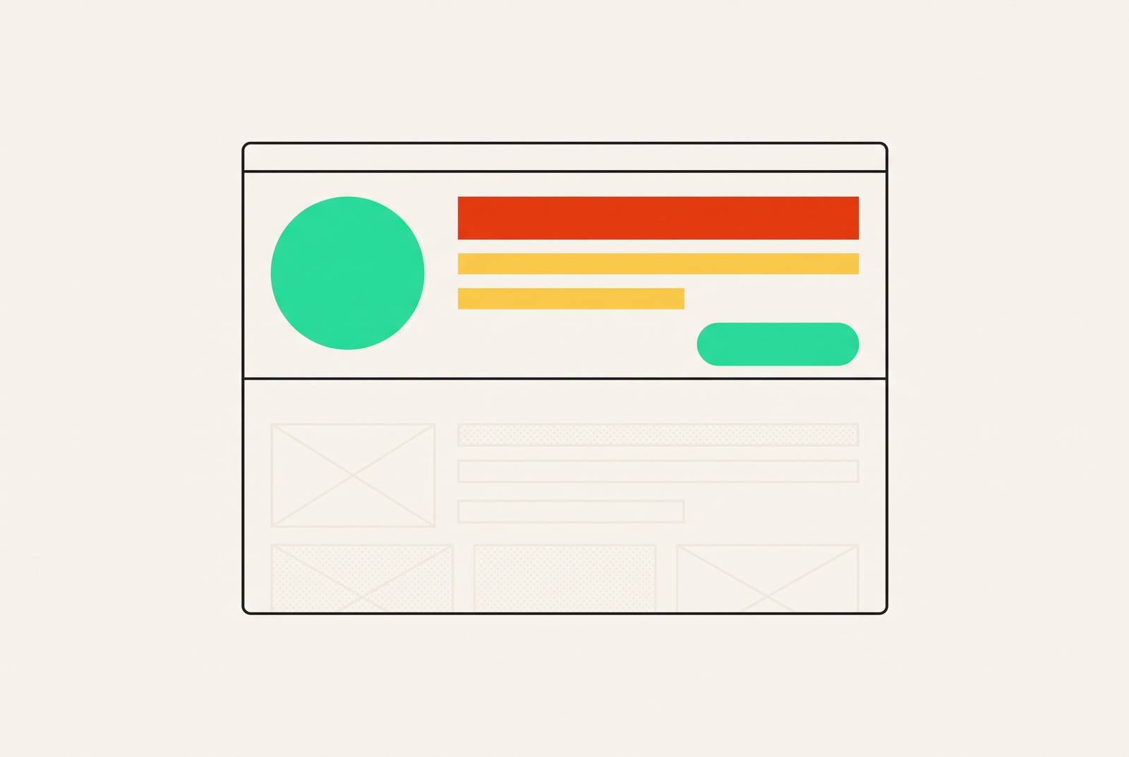
Four elements need to show up, and they need to show up in this order.
The headline states the primary benefit in plain, outcome-driven language rather than clever wordplay. Someone scanning at speed should know within a second what's actually on offer. The subheadline qualifies the audience and adds specificity: it cuts uncertainty for the right visitor while quietly telling the wrong visitor this isn't for them, which counts as its own kind of win.
The primary CTA sits visible without scrolling, visually distinct, worded around an action, placed right after the headline block. One or two CTAs, never a cluster, since a wall of buttons kills a decision faster than no buttons at all. Then comes the trust signal, positioned near the CTA, answering "can this be trusted" before the visitor forms a conscious objection: a logo wall, a review count, a specific proof point.
A useful formula for the value proposition itself: who gets helped, plus the pain being solved, plus the outcome or proof point, kept under 30 words. Run longer than that and the visitor has already moved on to something shorter.
The hero visual matters, but only in service of the headline. It reinforces the message without competing with it, and about 73% of landing pages use a human face somewhere in the hero. That works as emotional anchoring, especially in categories like SaaS that are otherwise abstract and hard to feel much of anything about.
Underneath all of it, what the whole hierarchy is doing is cutting cognitive load. The visitor shouldn't have to work to figure out what happens next.
Common failures repeat across startup pages like a greatest-hits album nobody asked for. The headline leads with the company name instead of the benefit. The subheadline just restates the headline in different words, the CTA sits below the fold on mobile, trust signals get buried in the footer, and the hero visual is some abstract gradient blob with no connection to anything the copy says.
How CTA design reflects (or fails) visitor intent
The CTA is where message match either survives or falls apart. Promise one thing in the headline, ask for something else in the button, and the visit is over.
Match the CTA to the intent signal. Someone arriving from a paid ad about a specific feature wants "Start your free trial" or "See it in action." Someone who searched "pricing" wants "View pricing" or "Get a quote." Someone coming in warm off a referral wants "Talk to us" or "Book a call." Generic CTAs like "Learn more" or "Get started" are intent-neutral, a polite way of saying they match no one's mental model at all.
Personalized CTA elements perform around 202% better than generic ones, and that gap comes almost entirely from intent alignment, not button color or font weight. Nobody converts better because the button turned a nicer shade of orange.
The senior creative's job here is less about writing button copy and more about figuring out what action this specific visitor is ready to take right now, then clearing the path to it. Placement discipline matters too: one primary CTA above the fold, and a secondary CTA only when a real chunk of visitors needs a lower-commitment option, something like "Watch the demo" sitting next to "Start free trial." What founders get wrong, over and over, is picking CTA copy by gut feel instead of mapping it to where the traffic actually came from. The result is one generic CTA trying to do five jobs at once, and doing all of them poorly.
Page speed as an ATF design variable, not a developer afterthought
None of the above matters if the page hasn't loaded yet, since speed is part of the design, not a technical detail bolted on afterward.
A one-second delay costs a 7% drop in conversions, which is the number worth sitting with, because it turns "the page feels a little slow" into a line item on a P&L. Largest Contentful Paint, or LCP, measures how fast the biggest visible element on the screen appears, usually the hero image, hero video, or headline block. Good LCP sits under 2.5 seconds, and a handful of design choices push that number around directly: hero image file size and format, whether a video autoplays above the fold, how fonts load in, how many third-party scripts fire the second the page opens.
Mobile traffic is the default context now, not the edge case, which means the ATF experience on a mid-tier phone over 4G is the experience that matters most. A creative brief that specifies visual requirements without specifying performance constraints is only half a brief. A hero video that tanks LCP undercuts its own purpose, no matter how cinematic it looks on the studio monitor. Senior creative directors treat speed as a constraint from day one, while teams without that kind of leadership tend to discover it the hard way, as a conversion problem, weeks after launch.
Why ATF strategy breaks down without senior creative ownership
Message match, intent mapping, structural hierarchy, CTA strategy, performance constraints: all of it requires judgment calls made before a brief even gets written. Those calls belong to a senior creative director, not to a production designer or a contractor handed a Figma file and a deadline.
A production designer can execute a layout, follow a style guide, and produce assets at volume, all genuinely valuable skills. What that same designer generally can't do without senior direction is decide which visitor segment owns a given page, what that segment's intent state actually is, and what the ATF hierarchy should prioritize for this specific campaign moment. The gap is about missing context, not missing skill.
The freelance model tends to make this worse, not better. A contractor hired per asset has no visibility into the campaign, no relationship with the traffic source data, and no accountability tied to how the page actually converts, and the asset gets delivered before the contractor moves to the next client.
Hiring in-house carries its own bottleneck. Median time-to-fill for a non-executive role runs around 39 days, per SHRM data, and a campaign window rarely sits around for five and a half weeks waiting for a hire to clear onboarding. Even teams that do hire in-house often underhire for the role: a mid-level designer at $56,000 to $65,000 base (closer to $75,000 to $80,000 once benefits and taxes get counted) rarely comes with the strategic ATF judgment the job calls for. That's a mismatch between the title and the task, not a knock on mid-level designers.
The pattern across most startup pages is someone with strong production skills and no strategic brief to work from, which is exactly why the failures showing up above the fold are strategic, not aesthetic.
What the ATF brief looks like when a senior creative leads it
A senior creative director starts with questions, not sketches. Where's this visitor coming from, and what did they just click or read? What single outcome do they want from this page? What's the one thing that would make them distrust the company on sight? What action are they ready to take right now, versus what needs more trust built first?
Only once those answers are locked down does the brief move to headline angle, subheadline specificity, CTA language, trust signal choice, visual hierarchy, and performance budget. The brief also spells out what the section must not do: no secondary messaging diluting the primary offer, no navigation inviting an exit, no leading with brand identity over benefit clarity.
Keeping brand consistency across multiple landing pages, different campaigns, different traffic sources, different audience segments, requires this brief process to sit with the same senior creative perspective every time. Skip that, and each page gets designed in its own bubble: different tone, different logic for what goes where, different CTA habits. Brand drift, basically, and it compounds over a campaign cycle the way interest compounds on a debt nobody's paying down.
Fractional creative leadership, a senior creative director retained part-time rather than hired full-time, is the model that puts this brief-stage ownership within reach for teams that can't justify or can't recruit a full-time CD. The embedded version matters most: a creative director woven into the actual campaign cadence, with access to traffic data and conversion numbers, makes sharper ATF calls than one parachuted in project by project with no memory of what happened last time.
The real question for a founder or a lean marketing team has always centered on who owns the brief that answers what the hero section should look like, and whether that person has the seniority and the context to answer it well.