Landing Page Launch Timeline for Early-Stage Startups
A structured five-phase timeline cuts landing page development from six weeks to ten days.
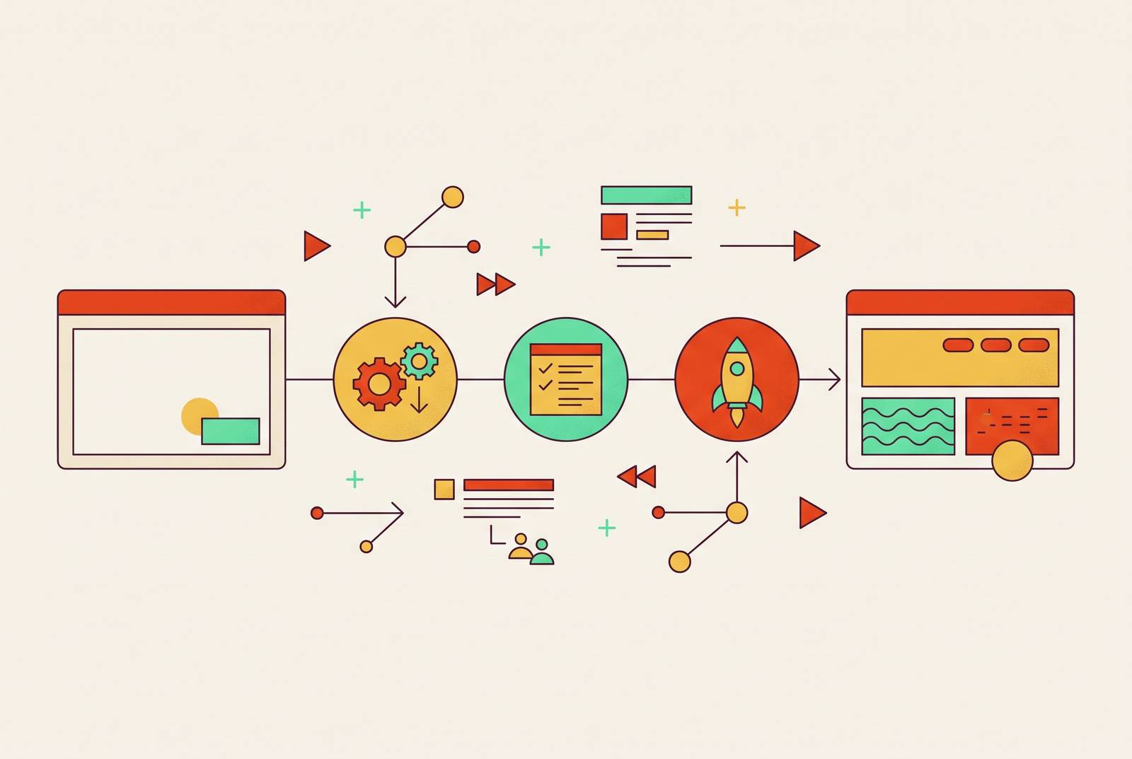
A landing page built without a timeline takes six weeks. A landing page built with one takes ten days. Same designer, same founder, same product. The only difference is whether anyone decided, up front, who does what and by when. This is a breakdown of that timeline: five phases, from first brief to first month of data, and who should own each one.
Where the weeks go: the revision loop problem and why it's a process failure, not a talent failure
Landing pages don't usually fail at launch. They fail before launch, stuck in a loop that gets worse with every lap around the track.
Here's the pattern, and it's remarkably consistent across early-stage teams. Founder has a vague idea and sends a rough note to a designer. Designer interprets that note and produces a first draft, doing their best with what amounts to a napkin sketch. Founder looks at it and doesn't know what to say, so out comes "make it pop" or "something's off, not sure what." Revisions multiply, but they don't converge; each round adds detail without adding direction. Three weeks in, the page ships half-finished, or it doesn't ship at all.
None of this is a talent problem. Good designers get stuck in this loop constantly, because the loop isn't about skill. It's about the absence of a brief, the absence of ownership, and the absence of someone senior enough to make a call and end the debate. Freelance setups make it worse, not better: more coordination overhead, more room for misread instructions, and nobody whose job it is to be accountable for the final page.
The fix isn't hiring a faster designer. It's a sequence, with clear handoffs and a senior creative owner sitting at each gate, resolving ambiguity before it snowballs. That sequence is what follows.
Phase 1 — Strategic brief: what must be decided before any design begins
Budget one to two days here. Nothing downstream fixes a brief that starts weak; this phase decides whether the page has a job to do or is just guessing.
The brief needs answers to a short list of hard questions. Who's the exact audience (not "developers," but "early-career backend engineers evaluating infrastructure tools for side projects")? What's the one action a visitor should take? What's the single claim the headline has to make, and what backs it up? What does success look like in 30 days, measured in signups, demo requests, or waitlist size? What tone and visual references match where the brand is actually headed, not where it started?
A senior creative lead should own this, a Fractional Creative Director fits the role well, because the job is pulling clarity out of the founder, not asking the founder to arrive with clarity already packaged. Founders shouldn't write their own brief. They're too close to the product and too likely to lead with features when the page needs to lead with benefits.
Treat the brief as a deliverable in its own right, not throat-clearing before the "real" work starts. It gets reviewed and signed off before design opens. A Project Manager keeps that sign-off from turning into a week-long group chat by setting a deadline for it at kickoff.
Phase 2 — Messaging architecture: structuring the argument the page will make
One to two days, running alongside or right after the brief gets approved.
Messaging architecture isn't copywriting yet. It's the skeleton the copy will later hang on: what goes where, and why that order and not another. A standard build for an early-stage page runs like this. The hero carries one sharp headline (the claim), a subhead that explains why it matters, and a primary CTA (a secondary one is optional). Right after that comes a social proof anchor: a logo bar, a waitlist count, a named beta user, anything that signals someone else already decided to trust this. Then a problem/solution section, two or three sentences, empathy first and product second. Then three or four feature points, each one tied to an outcome the visitor actually cares about. Then a proof layer: a testimonial, a case result, a real number if one exists. It closes with a CTA that mirrors the hero but asks with slightly more conviction.
Evil Martians' review of over 100 developer tool landing pages, published in mid-2025, found hero sections with two CTAs — one to convert, one to deliver something useful right away — as a pattern worth adopting. The same review found specific action language ("Start building," "Download now") consistently beats generic filler like "Get started." Worth stealing both findings outright.
One more detail that punches above its size: the "eyebrow," a small line sitting above the headline that flags a launch, a funding round, or a new release. It signals momentum on a page that has no brand equity to lean on yet, which is exactly the position every early-stage startup is in.
The Fractional Creative Director owns this phase, working closely with whoever holds the product knowledge, usually the founder. The output is a document, not a design; it's wireframe logic written in sentences. Getting sign-off here, before a single pixel gets placed, prevents the most expensive kind of revision there is: tearing apart the structure after the visuals are already built.
Phase 3 — Visual design: translating the message into a page that earns trust on first look
Two to three days for the first concept, one more day for a tight, single round of revisions.
Design isn't decoration bolted onto the message. It's the system that makes the message believable the instant someone lands on the page. Good design at this stage does a few specific things: it builds a visual hierarchy that pulls the eye from headline to CTA without friction, it keeps typography, color, and spacing consistent enough to feel deliberate rather than assembled from a template pile, and it gives the product something concrete to point at, a screenshot, a dashboard preview, a before-and-after. It also assumes mobile first, since most early traffic lands through a direct link on a phone, not a desktop browser with sixteen tabs open.
The gap between a senior designer and a junior one shows up fastest right here. A senior designer makes layout choices that serve the message. A junior designer makes layout choices that look fine in isolation but don't point anywhere in particular. The Fractional Creative Director's job in this phase is reviewing the work against the brief and the messaging doc before the founder ever sees it, so what lands in the founder's inbox is a considered recommendation, not a rough first pass dressed up as one.
Feedback protocol matters more than people expect. One structured round, written, specific, no vague notes like "make it feel more modern," keeps this phase contained to its allotted days instead of ballooning into a second week of live calls that go nowhere. And whatever gets locked in here (typography, color, spacing) becomes the reference point every future asset traces back to: the deck, the ads, the social graphics, all of it.
Phase 4 — Development handoff and build: getting the design into a live URL without losing what was designed
Two to four days, depending on complexity and the platform chosen.
This is where fidelity dies quietest. Spacing collapses. Fonts get swapped for whatever's installed locally. Mobile layouts that looked fine in Figma break the second they hit a real screen. A clean handoff avoids that with annotated files (not a bare link and a "good luck"), explicit specs for spacing, type sizes, breakpoints, and hover states, and pre-optimized asset exports so the developer isn't left guessing what a designer meant by "make this pop" (that phrase again, somehow always circling back).
Platform choice changes the shape of this phase. No-build tools like Webflow or Framer let designer and developer roles blur together, which speeds up straightforward pages considerably. Custom-coded builds push the fidelity ceiling higher but take longer and demand tighter specs going in. CMS-based builds make sense when the page needs to grow, adding a blog, running A/B tests, supporting multiple languages down the line.
The Project Manager's job here is holding the build to its timeline and catching drift from spec before it stacks up into something unfixable. QA isn't a quick glance at the end; it's a deliverable in its own right, covering cross-browser and cross-device checks, load time, and form submission testing, all before the page counts as done. Founder involvement should be light in this phase: one review of the staging environment, not a reopening of decisions that were already closed in Phase 3.
Phase 5 — Pre-launch review: what to check before the page goes live and who has final authority
One day. This is not a design review; design decisions are closed by now. It's a readiness check against a fixed list, nothing more freewheeling than that.
The list itself: does the page load in under three seconds on mobile (load time affects both conversion and search ranking, so this isn't a nice-to-have)? Does the CTA form actually submit and trigger the right confirmation or redirect? Is analytics firing correctly across page views, CTA clicks, and form completions? Are the meta title, meta description, and OG image set, so a shared link doesn't show up blank on social? Does it render properly on Chrome, Safari, and Firefox, desktop and mobile both? Is every piece of copy final, no leftover placeholder text, no lorem ipsum hiding in a footer nobody scrolled to?
Sign-off splits three ways: the Fractional Creative Director confirms creative fidelity, the Project Manager confirms the process actually got completed end to end, and the founder gives the final go-live approval. The mistakes that get caught late and cost days instead of hours are almost always the same handful: a broken form, missing analytics, an unoptimized image dragging load time, a missing OG image making every social share look like an error. None of that is bureaucracy for its own sake. A broken page at launch costs more than a one-day delay ever will.
What the full timeline looks like when it runs cleanly
Brief to go-live, a well-run landing page launch takes seven to ten working days. Laid out: days one and two cover the strategic brief, written and signed off. Days two and three finalize messaging architecture. Days three through six cover visual design plus one revision round. Days six through nine are development and QA. Day ten is pre-launch review and launch itself.
What compresses that timeline: a clean brief sign-off, messaging locked before design opens, feedback delivered in writing instead of relitigated on a call, and senior talent who don't need hand-holding mid-execution. What stretches it out: a vague brief, a founder who reopens messaging questions while looking at visual comps, a developer working from incomplete specs, or nobody tracking the calendar at all.
The order matters, and skipping steps to "save time" is exactly how a ten-day page turns into a six-week one. A subscription creative setup, designer, Fractional Creative Director, and Project Manager operating as a single unit rather than three separate vendors, fits this timeline structurally: same-day kickoff, every role coordinated from the start, no handoff friction between people who've never worked together before. A page that ships in ten days and converts anywhere near the median (Lander Lab put that figure at 6.6%) is earning its spot in the funnel. A page that ships in six weeks, revised into a compromise nobody's happy with, earns nothing.
What to measure in the first 30 days after launch and how to use it
Launch is the start of the test, not the end of it. The page is a hypothesis, and the first 30 days are where it either holds up or doesn't.
Track conversion rate on the primary CTA first, measured against that 6.6% median (Lander Lab) as a baseline. Then look at traffic source, because where visitors come from (direct, social, referral, search) changes what a given conversion number actually means. Scroll depth matters too: drop-off above the fold usually points to a headline problem, while drop-off right before the CTA points to a trust or proof problem instead. Time on page cuts both ways, too short suggests the message isn't landing, too long on a simple page suggests confusion or friction somewhere in the flow. And form drop-off, visitors who start filling it out but never finish, almost always traces back to length or friction in the form itself.
For a waitlist specifically, benchmarks run wide: 2 to 5% on cold B2B lists, 6 to 12% on warm traffic, and 20% or higher when the product-market fit is real rather than assumed; warm traffic overall can run anywhere from 20 to 40%.
Not everything on the page deserves the same treatment once the data starts coming in. Headline and CTA copy are the highest-leverage, fastest things to test, and they should get changed one variable at a time so it's clear what actually moved the number. Layout and structure should stay put unless scroll data specifically flags a structural problem; reopening design decisions on a hunch is how the whole revision loop from Phase 0 sneaks back in through the side door. Social proof, testimonials, logos, user counts, should keep updating as real evidence piles up. That part of the page is never really finished, and it shouldn't be.